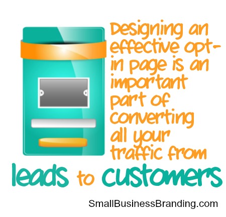
Sometimes called a squeeze page, designing an effective opt-in page is an important part of converting all your traffic from leads to customers. If you don’t have a high converting squeeze page, you’ll miss out on a lot of new customers no matter how much traffic is sent your way.
Target the Right Audience
If you’ve done your research then you’ve chosen a specific persona or target audience in which to direct your opt-in page. You cannot build an effective opt-in page if you’re trying to target more than one type of person with your content. Reducing the number of people you appeal to, rather than trying to attract a broader audience, may sound counterintuitive. But the truth is, the more laser targeted your opt-in page, the better. Don’t worry; you can create more than one.
Example: You guest blog for XYZ blog. In your bio box you include a link to a special squeeze page, instead of sending that unique audience to the same generic squeeze page as everyone else.
Craft Excellent Design
Designing a squeeze page requires an understanding of color palettes as well as how people read online. Online, people scan from top to bottom rather than reading from left to right when they first see the page. Keep that in mind and ensure that you have excellent navigation, with fewer choices than a typical website, and that the colors are easy on the eyes. A light background with darker lettering and a color palette of three to four colors is your best choice. It’s nice if your opt-in page matches the product that you’re selling.
Create a Strong Headline
When it comes to squeeze pages, headlines matter. If you use an overly clever headline, some people will be put off by it. If you choose a headline that is direct, to the point, and tells in a nutshell what this page is about, you’ll develop trust quickly from your readers. The headline must address the interests (or problem) of the target audience, be good news to them (you’re going to solve their problem), pique their curiosity (hook them in), and make it all simple, easy, and fast that also saves them something like time and money.
Add in an Offer They Can’t Refuse
Whether it’s a free offer, or a paid offering, make the deal so good that they can’t refuse. If you’ve targeted your audience in an appropriate way, the offer will resonate with them. Moving them from lead to subscriber will help you build your list so that you can provide value to them later, and over time. Make it clear about the value you will provide them, the problems you’ll solve, and the advantages of being a member of your list or buying your products.
Create Obvious CTA Buttons
Your sign up buttons, or buy buttons, need to be very obvious. You can create awesome sign up forms with Aweber, and Buy Now Buttons using Amember.com, Clickbank.com, and other services. Using the available software, the fewer fields you have in your form, the more likely you are to get someone to sign up. Your call to action (CTA) is very important and needs to be clear to your audience. Your buttons can say something aside from “submit,†“buy now,†or “subscribeâ€. You can make them say more such as “Give me my free video nowâ€, or “Hell yea, I want my free eBook.†Whatever text or message your audience will respond to is what should be on your buttons.
Create Responsive Opt-in Pages
Today, people access the Internet via mobile devices more than they do personal computers. What a shame if your opt-in pages won’t work on mobile devices. By using responsive design and tools that allow for responsive design, you can avoid those issues. After all, you only have one chance, and only a few seconds, to get your audience’s attention and trust. Don’t lose them due to this issue.
Don’t Forget the Download / Thank You Page
The design you create for your download or thank you page should be as thought out as your opt-in page. Every aspect of the process should be very well thought out with your audience in mind.
Create a Pretty URL
Many times a squeeze page will have its own domain name, or you can create it as a new page on your website then use domain masking to save on hosting fees.
This works like this: Create a new page on one of your websites to house the opt-in page, so the URL might look like this:
Yourdomainname.com/offeryoucantrefuse. This isn’t that pretty.
Instead you can spend 10 bucks on a new domain name – one that represents the list or product you’re selling – then using the procedures right where you create your domain name, such as GoDaddy to mask the look of the domain without paying for additional hosting. Just go in and paste the link to your opt-in page by clicking manage domains > nameservers > manage >add forwarding. Then paste in the URL that leads to your opt-in page, then choose “forward with masking.â€
Now when someone clicks the link to your opt-in page they will see what looks like a dedicated website, which often is perceived as more professional. You can also use a shortening service like bitly.com or Google URL Shortener.
Finally, practice makes perfect. Test out different opt-in pages, different forms, different buttons, and different headlines to find out what works best for your audience. Keep track of the metrics so that you can analyze what works.
If you’ve done your research then you’ve chosen a specific persona or target audience in which to direct your opt-in page. You cannot build an effective opt-in page if you’re trying to target more than one type of person with your content.
Agreed. Landing and opt-in pages have to be specific and targeted. You can create some more generic ones but the conversion will be less than spectacular and you’d expect that. Good thing it doesn’t cost extra to create more landing pages. Even when you’re giving out the same exact freebie and opting in the to the same exact list. Having specific landing pages for an intended audience never hurts.
Hi Jennifer,
Ok, this is awesome but now we have to put it to the test!!!
I’m going to create a page this week with all these steps and let’s see where we’re at!
=)
agreed with all the listed things about creating effective squeeze pages, but we also need to keep on checking whether the page is giving the kind of response we are expecting or it needs to modified or changed. Sometimes a small things like color combination distracts your visitors from becoming your subscribers.